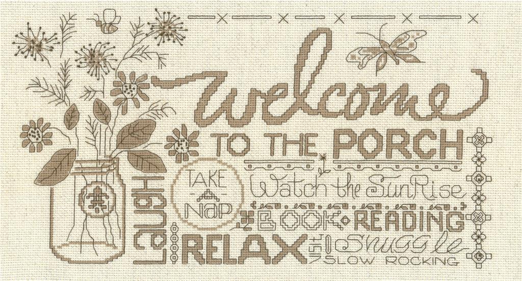
Porch Welcome wip now completed
Currently I'm using 3 strand of DMC 815 on 14ct. The second color I have is DMC 902. But, I don't think there is going to be enough contrast between the two colors.
Any suggestions to a second color? Thoughts on black?
Posted by: MarzHere on 03/08/18
View Item
Post a Reply
View Item
Please Wait ...
Page:
1
2
- 5
- 10
- 25
- 50
- Post Date
- New Replies
Please Wait ...
Hmm .... black and red are my favorite combination, and I think that would look nice if you wanted to keep the color dark and bold. You could also try a darker shade of the color variation in your cloth. That might make for an interesting combination and would blend with the cloth as well - like maybe 167 or 780.
Posted by: adcoresky on 03/08/18
I have this pattern, haven't done it yet. However I love what you did with the red!!! I have a country blue door, so I might have to steal your idea and do mine in blue. The original looks really dull compared to the red. Great job!!!
Posted by: jaba on 03/08/18
Instead of true black (310), I think I would go with black brown (3371). It would be a little softer. Also I love red work and would think about just 815. Very cute pattern.
Posted by: MarshaR on 03/08/18
Love the red.
Posted by: surt8511 on 03/08/18
Red's always a winner-love your pattern.
Posted by: pamelastine11 on 03/08/18
Another Diane Arthurs classic!! I have now done three of her patterns and the latest one - All Because - is away getting framed. They are so lovely to do and you can change the colours if you wish to suit your surroundings.
Posted by: deirdre on 03/08/18
Thanks for the suggestions. I like them all and they seem to be better than the black. Interesting thought to do it all in the current color. Maybe I'll compromise and do the flower stems in a second color, but do all else in current color. I'll be at Wal-Mart on Saturday (for my "monthly trip to a bigger town than I live in") and will see what of these they have.
Posted by: MarzHere on 03/08/18
Hi Marz. I love your adaptation. It makes the design come alive. I agree with Marshair about the dmc black/brown in place of black. I did a baby announcement kit that used black for the lettering and changed it to 3371. It was still enough to contrast, but not so harsh as black. Karen
Posted by: luvtoxstitch on 03/08/18
I love this change up in colors, MarzHere!! The red looks so great on that fabric :) I agree that doing it all red or using the 3371 as a secondary color are both good options! Thanks for sharing your wonderful work with us :)
~Kristi @ ECS
~Kristi @ ECS
Posted by: Kristi @ ECS on 03/09/18
You might try tweeding two colours together. I've sometimes used that method to get a different effect. Looking good!!
Posted by: momcat25 on 03/09/18